 AI
AI
 ChatGPT
 Gemini
 Thư viện Prompt
 Công nghệ
 Học IT
 Tiện ích
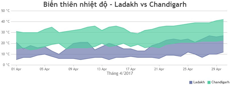
Code mẫu JavaScript tạo mẫu biểu đồ vùng theo phạm vi đa cấp

Giống như bất kỳ biểu đồ khác trong CanvasJS, Range Area Graph cũng hỗ trợ nhiều chuỗi dữ liệu. Biểu đồ/đồ thị vùng theo phạm vi đa chuỗi hữu ích khi so sánh hai hoặc nhiều số lượng hơn (có phạm vi giá trị cao và thấp).
Ví dụ bên dưới minh họa biểu đồ vùng theo phạm vi đa chuỗi với trục thời gian theo ngày tháng. Nó cũng chứa mã nguồn mà bạn có thể chỉnh sửa trong trình duyệt hoặc lưu về máy để chạy nội bộ.
<!DOCTYPE HTML>
<html>
<head>
<script>
window.onload = function () {

var chart = new CanvasJS.Chart("chartContainer", {
	exportEnabled: true,
	animationEnabled: true,
	theme: "light2",
	title:{
		text: "Biến thiên nhiệt độ - Ladakh vs Chandigarh"
	},
	axisX: {
		title: "Tháng 4/2017",
		valueFormatString: "DD MMM"
	},
	axisY: {
		suffix: " °C"
	},
	toolTip: {
		shared: true
	},
	legend: {
		cursor: "pointer",
		horizontalAlign: "right",
		itemclick: toggleDataSeries
	},
	data: [{
		type: "rangeArea",
		showInLegend: true,
		name: "Ladakh",
		markerSize: 0,
		yValueFormatString: "#0.## °C",
		dataPoints: [
			{ x: new Date(2017, 03, 01), y: [05, 21] },
			{ x: new Date(2017, 03, 02), y: [07, 15] },
			{ x: new Date(2017, 03, 03), y: [07, 18] },
			{ x: new Date(2017, 03, 04), y: [09, 16] },
			{ x: new Date(2017, 03, 05), y: [10, 17] },
			{ x: new Date(2017, 03, 06), y: [08, 13] },
			{ x: new Date(2017, 03, 07), y: [06, 10] },
			{ x: new Date(2017, 03, 08), y: [06, 15] },
			{ x: new Date(2017, 03, 09), y: [06, 20] },
			{ x: new Date(2017, 03, 10), y: [05, 21] },
			{ x: new Date(2017, 03, 11), y: [06, 21] },
			{ x: new Date(2017, 03, 12), y: [07, 14] },
			{ x: new Date(2017, 03, 13), y: [07, 17] },
			{ x: new Date(2017, 03, 14), y: [05, 20] },
			{ x: new Date(2017, 03, 15), y: [07, 18] },
			{ x: new Date(2017, 03, 16), y: [07, 15] },
			{ x: new Date(2017, 03, 17), y: [08, 15] },
			{ x: new Date(2017, 03, 18), y: [07, 13] },
			{ x: new Date(2017, 03, 19), y: [07, 13] },
			{ x: new Date(2017, 03, 20), y: [07, 18] },
			{ x: new Date(2017, 03, 21), y: [06, 20] },
			{ x: new Date(2017, 03, 22), y: [09, 23] },
			{ x: new Date(2017, 03, 23), y: [09, 24] },
			{ x: new Date(2017, 03, 24), y: [08, 23] },
			{ x: new Date(2017, 03, 25), y: [12, 24] },
			{ x: new Date(2017, 03, 26), y: [10, 21] },
			{ x: new Date(2017, 03, 27), y: [07, 24] },
			{ x: new Date(2017, 03, 28), y: [10, 27] },
			{ x: new Date(2017, 03, 29), y: [10, 26] },
			{ x: new Date(2017, 03, 30), y: [12, 27] }
		]
	},
	{
		type: "rangeArea",
		showInLegend: true,
		name: "Chandigarh",
		markerSize: 0,
		yValueFormatString: "#0.## °C",
		dataPoints: [
			{ x: new Date(2017, 03, 01), y: [15, 31] },
			{ x: new Date(2017, 03, 02), y: [16, 30] },
			{ x: new Date(2017, 03, 03), y: [14, 30] },
			{ x: new Date(2017, 03, 04), y: [15, 30] },
			{ x: new Date(2017, 03, 05), y: [17, 33] },
			{ x: new Date(2017, 03, 06), y: [19, 35] },
			{ x: new Date(2017, 03, 07), y: [20, 30] },
			{ x: new Date(2017, 03, 08), y: [15, 31] },
			{ x: new Date(2017, 03, 09), y: [16, 32] },
			{ x: new Date(2017, 03, 10), y: [16, 33] },
			{ x: new Date(2017, 03, 11), y: [16, 35] },
			{ x: new Date(2017, 03, 12), y: [17, 36] },
			{ x: new Date(2017, 03, 13), y: [20, 32] },
			{ x: new Date(2017, 03, 14), y: [17, 35] },
			{ x: new Date(2017, 03, 15), y: [18, 36] },
			{ x: new Date(2017, 03, 16), y: [20, 34] },
			{ x: new Date(2017, 03, 17), y: [17, 30] },
			{ x: new Date(2017, 03, 18), y: [19, 29] },
			{ x: new Date(2017, 03, 19), y: [16, 32] },
			{ x: new Date(2017, 03, 20), y: [17, 33] },
			{ x: new Date(2017, 03, 21), y: [16, 35] },
			{ x: new Date(2017, 03, 22), y: [19, 36] },
			{ x: new Date(2017, 03, 23), y: [20, 36] },
			{ x: new Date(2017, 03, 24), y: [21, 37] },
			{ x: new Date(2017, 03, 25), y: [21, 38] },
			{ x: new Date(2017, 03, 26), y: [21, 39] },
			{ x: new Date(2017, 03, 27), y: [22, 39] },
			{ x: new Date(2017, 03, 28), y: [22, 39] },
			{ x: new Date(2017, 03, 29), y: [22, 41] },
			{ x: new Date(2017, 03, 30), y: [23, 42] }
		]
	}]
});
chart.render();

function toggleDataSeries(e) {
	if (typeof (e.dataSeries.visible) === "undefined" || e.dataSeries.visible) {
		e.dataSeries.visible = false;
	} else {
		e.dataSeries.visible = true;
	}
	e.chart.render();
}

}
</script>
</head>
<body>
<div id="chartContainer" style="height: 300px; width: 100%;"></div>
<script src="https://canvasjs.com/assets/script/canvasjs.min.js"></script>
</body>
</html>Nguồn: CanvasJS
Tùy biến biểu đồ/đồ thị
Bạn có thể thiết lập indexLabel trong biểu đồ vùng theo phạm vi này để hiện các giá trị cao và thấp của từng mốc dữ liệu. Chia sẻ tooltip cho các chuỗi khác nhau cũng khiến nó dễ đọc hơn. Bạn có thể làm việc đó bằng cách dùng thuộc tính shared.
Một số tùy chọn thường dùng khác là color - màu sắc, lineColor - màu sắc đường thẳng, fillOpacity - độ mờ khi lấp đầy vùng, showInLegend - Hiện chú giải…
Bạn nên đọc


Theo Nghị định 147/2024/ND-CP, bạn cần xác thực tài khoản trước khi sử dụng tính năng này. Chúng tôi sẽ gửi mã xác thực qua SMS hoặc Zalo tới số điện thoại mà bạn nhập dưới đây:
 Hướng dẫn AI
 Ứng dụng
 Hệ thống
 Game - Trò chơi
 iPhone
 Android
 Làng Công nghệ
 Hàm Excel
 Cuộc sống
 Khoa học