 AI
AI
 ChatGPT
 Gemini
 Thư viện Prompt
 Công nghệ
 Học IT
 Tiện ích
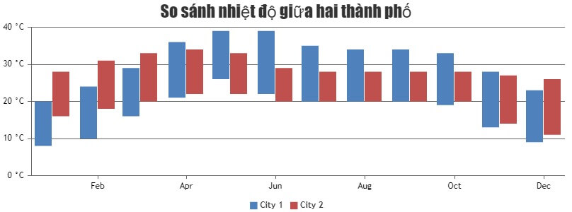
Code mẫu JavaScript tạo biểu đồ cột nhiều chuỗi dữ liệu

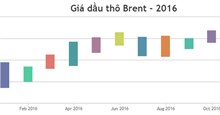
Biểu đồ cột đa chuỗi dữ liệu giúp trực quan hóa các nhóm dữ liệu theo phạm vi liên quan, chẳng hạn như giá trị cao và thấp. Những biểu đồ đa chuỗi dữ liệu rất hữu ích khi so sánh sự khác biệt giữa nhiều chuỗi dữ liệu.
Ví dụ bên dưới minh họa một biểu đồ cột đa dãy được tạo bằng JavaScript. Bạn sẽ có cả code nguồn để chỉnh sửa như ý muốn.
<!DOCTYPE HTML>
<html>
<head>
<script>
window.onload = function () {

var chart = new CanvasJS.Chart("chartContainer", {
	animationEnabled: true,
	exportEnabled: true,
	title:{
		text: "So sánh nhiệt độ giữa hai thành phố"
	},
	axisX: {
		valueFormatString: "MMM"
	},
	axisY: {
		suffix: " °C"
	},
	toolTip: {
		shared: true
	},
	legend: {
		cursor: "pointer",
		itemclick: toggleDataSeries
	},
	data: [{
		type: "rangeColumn",
		name: "City 1",
		showInLegend: true,
		yValueFormatString: "#0.## °C",
		xValueFormatString: "MMM, YYYY",
		dataPoints: [
			{ x: new Date(2016, 00), y: [08, 20] },
			{ x: new Date(2016, 01), y: [10, 24] },
			{ x: new Date(2016, 02), y: [16, 29] },
			{ x: new Date(2016, 03), y: [21, 36] },
			{ x: new Date(2016, 04), y: [26, 39] },
			{ x: new Date(2016, 05), y: [22, 39] },
			{ x: new Date(2016, 06), y: [20, 35] },
			{ x: new Date(2016, 07), y: [20, 34] },
			{ x: new Date(2016, 08), y: [20, 34] },
			{ x: new Date(2016, 09), y: [19, 33] },
			{ x: new Date(2016, 10), y: [13, 28] },
			{ x: new Date(2016, 11), y: [09, 23] }
		]
		},
		{
			type: "rangeColumn",
			name: "City 2",
			showInLegend: true,
			yValueFormatString: "#0.## °C",
			xValueFormatString: "MMM, YYYY",
			dataPoints: [
				{ x: new Date(2016, 00), y: [16, 28] },
				{ x: new Date(2016, 01), y: [18, 31] },
				{ x: new Date(2016, 02), y: [20, 33] },
				{ x: new Date(2016, 03), y: [22, 34] },
				{ x: new Date(2016, 04), y: [22, 33] },
				{ x: new Date(2016, 05), y: [20, 29] },
				{ x: new Date(2016, 06), y: [20, 28] },
				{ x: new Date(2016, 07), y: [20, 28] },
				{ x: new Date(2016, 08), y: [20, 28] },
				{ x: new Date(2016, 09), y: [20, 28] },
				{ x: new Date(2016, 10), y: [14, 27] },
				{ x: new Date(2016, 11), y: [11, 26] }
			]
	}]
});
chart.render();

function toggleDataSeries(e) {
	if (typeof (e.dataSeries.visible) === "undefined" || e.dataSeries.visible) {
		e.dataSeries.visible = false;
	} else {
		e.dataSeries.visible = true;
	}
	e.chart.render();
}

}
</script>
</head>
<body>
<div id="chartContainer" style="height: 300px; width: 100%;"></div>
<script src="https://canvasjs.com/assets/script/canvasjs.min.js"></script>
</body>
</html>
Nguồn: CanvasJS
Tùy chỉnh biểu đồ
Tương tự như các biểu đồ được tạo bằng JavaScript, bạn có thể chỉnh sửa các thuộc tính liên quan để đạt được kết quả như ý muốn. Ví dụ:
showInLegend: Hiện chú giảiverticalAlign: Đặt chú giải theo chiều dọchorizontalAlign: Đặt chú giải theo chiều ngangShared(toolTip): Chia sẻ tooltipcolor: Màu sắclegendText: Kiểu text chú giảifillOpacity: Độ mờ- Và nhiều hơn thế nữa.
233
Bạn nên đọc
-

Code JavaScript tạo biểu đồ/đồ thị động
-
Code JavaScript tạo mẫu biểu đồ kết hợp OHLC và biểu đồ đường
-
Code JavaScript tạo biểu đồ thanh đa chuỗi dữ liệu
-
Code JavaScript biểu đồ cột với nhiều trục
-
Code JavaScript tạo biểu đồ thanh có ngắt trục tọa độ
-
Code JavaScript tạo biểu đồ đa chuỗi update dữ liệu trực tiếp
-
JavaScript là gì?
-
Tổng hợp bài tập JavaScript có code mẫu
-
Code JavaScript tạo biểu đồ/đồ thị cột theo phạm vi


Xác thực tài khoản!
Theo Nghị định 147/2024/ND-CP, bạn cần xác thực tài khoản trước khi sử dụng tính năng này. Chúng tôi sẽ gửi mã xác thực qua SMS hoặc Zalo tới số điện thoại mà bạn nhập dưới đây:
Số điện thoại chưa đúng định dạng!
0 Bình luận
Sắp xếp theo
Xóa
Đăng nhập để Gửi
 Hướng dẫn AI
 Ứng dụng
 Hệ thống
 Game - Trò chơi
 iPhone
 Android
 Làng Công nghệ
 Hàm Excel
 Cuộc sống
 Khoa học