 AI
AI
 Hướng dẫn AI
 Claude
 ChatGPT
 Gemini
 Thư viện Prompt
 Công nghệ
 Học IT
 Tiện ích

Bootstrap là phương tiện phát triển web, ứng dụng phổ biến. Nhằm giúp bạn hiểu rõ hơn, Quantrimang.com sẽ tổng hợp và giải đáp những câu hỏi thường gặp về Bootstrap.
Cách mở menu thả xuống khi trỏ chuột thay vì click trong Bootstrap?
Trả lời: Dùng phương thức jQuery hover()
Mặc định, để mở hoặc hiển thị menu thả xuống trong Bootstrap, bạn phải click vào phần tử trình kích hoạt này. Tuy nhiên, nếu muốn hiện menu thả xuống khi trỏ chuột qua thay vì click, bạn có thể làm việc đó bằng một tinh chỉnh nhỏ bằng CSS và jQuery.
Ví dụ:
<!DOCTYPE html>
<html lang="en">
<head>
<meta charset="utf-8">
<title>Activate Bootstrap Dropdown with Hover</title>
<link rel="stylesheet" href="https://stackpath.bootstrapcdn.com/bootstrap/4.5.0/css/bootstrap.min.css">
<script src="https://code.jquery.com/jquery-3.5.1.min.js"></script>
<script src="https://stackpath.bootstrapcdn.com/bootstrap/4.5.0/js/bootstrap.min.js"></script>
<style>
.dropdown:hover .dropdown-menu{
display: block;
}
.dropdown-menu{
margin-top: 0;
}
</style>
<script>
$(document).ready(function(){
$(".dropdown").hover(function(){
var dropdownMenu = $(this).children(".dropdown-menu");
if(dropdownMenu.is(":visible")){
dropdownMenu.parent().toggleClass("open");
}
});
});
</script>
</head>
<body>
<nav class="navbar navbar-expand-sm navbar-dark bg-dark">
<a href="#" class="navbar-brand">Quantrimang.com</a>
<button type="button" class="navbar-toggler" data-toggle="collapse" data-target="#navbarCollapse">
<span class="navbar-toggler-icon"></span>
</button>

<div class="collapse navbar-collapse" id="navbarCollapse">
<div class="navbar-nav">
<a href="#" class="nav-item nav-link active">Home</a>
<a href="#" class="nav-item nav-link">Profile</a>
<div class="nav-item dropdown">
<a href="#" class="nav-link dropdown-toggle" data-toggle="dropdown">Messages</a>
<div class="dropdown-menu">
<a href="#" class="dropdown-item">Inbox</a>
<a href="#" class="dropdown-item">Sent</a>
<a href="#" class="dropdown-item">Drafts</a>
</div>
</div>
</div>
</div>
</nav>
</body>
</html>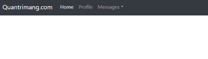
Như bạn thấy, ví dụ dùng CSS media query để hiện menu thả xuống khi trỏ chuột chỉ trên thiết bị nhỏ, trung bình và lớn bởi nó không phù hợp với những thiết bị nhỏ hơn như điện thoại. Ngoài ra, bổ sung một số jQuery thêm class .open để làm nổi bật menu thả xuống.
Thêm tooltip Bootstrap vào một icon như thế nào?
Trả lời: Dùng .tooltip()
Bạn có thể sử dụng tooltip Bootstrap trên Glyphicons như đã thực hiện ở các phần tử khác. Trước tiên, thêm thuộc tính dữ liệu data-toggle="tooltip" và data-original-title="Text" vào phần tử icon và cuối cùng khởi tạo tooltip bằng .tooktip() của Bootstrap.
Ngoài ra, bạn cũng có thể đặt những icon này vào bên trong phần tử <a> nếu muốn liên kết nó hoặc triển khai một số tác vụ cùng với chúng.
Ví dụ:
<!DOCTYPE html>
<html lang="en">
<head>
<meta charset="utf-8">
<title>Example of Bootstrap Glyphicons with Tooltip</title>
<link rel="stylesheet" href="https://stackpath.bootstrapcdn.com/bootstrap/4.5.0/css/bootstrap.min.css">
<link rel="stylesheet" href="https://maxcdn.bootstrapcdn.com/font-awesome/4.7.0/css/font-awesome.min.css">
<script src="https://code.jquery.com/jquery-3.5.1.min.js"></script>
<script src="https://cdn.jsdelivr.net/npm/popper.js@1.16.0/dist/umd/popper.min.js"></script>
<script src="https://stackpath.bootstrapcdn.com/bootstrap/4.5.0/js/bootstrap.min.js"></script>
<script>
$(document).ready(function(){
$('[data-toggle="tooltip"]').tooltip({
placement : 'top'
});
});
</script>
<style>
.bs-example{
margin: 50px;
}
.bs-example a{
font-size: 22px;
text-decoration: none;
margin: 0 10px;
}
</style>
</head>
<body>
<div class="bs-example">
<a href="#"><span class="fa fa-share" data-toggle="tooltip" data-original-title="Share"></span></a>
<a href="#"><span class="fa fa-edit" data-toggle="tooltip" data-original-title="Edit"></span></a>
<a href="#"><span class="fa fa-download" data-toggle="tooltip" data-original-title="Download"></span></a>
<a href="#"><span class="fa fa-repeat" data-toggle="tooltip" data-original-title="Refresh"></span></a>
<a href="#"><span class="fa fa-filter" data-toggle="tooltip" data-original-title="Filter"></span></a>
<a href="#"><span class="fa fa-gear" data-toggle="tooltip" data-original-title="Setting"></span></a>
<p class="mt-4"><strong>Note:</strong> Đặt trỏ chuột trên icon để thấy tooltip.</p>
</div>
</body>
</html>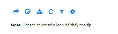
Cách thêm icon vào nút đăng ký hay Submit trong Bootstrap như thế nào?
Trả lời: Dùng Property CSS
Vì <input> là một phần tử trống, bạn không thể đặt HTML icon trực tiếp vào bên trong nút input như thường làm với các button bằng <button>.
Tuy nhiên, bạn có thể đặt Glyphicon bên ngoài nút nhập và đẩy nó vào bên trong để tạo hiệu ứng trông giống như icon được đặt bên trong chính nút đó bằng cách sử dụng các kỹ thuật định vị CSS.
Hãy thử ví dụ sau để hiểu cơ bản nó hoạt động như thế nào:
<!DOCTYPE html>
<html lang="en">
<head>
<meta charset="utf-8">
<title>Creating the Bootstrap Input Buttons with Icons</title>
<link rel="stylesheet" href="https://stackpath.bootstrapcdn.com/bootstrap/4.5.0/css/bootstrap.min.css">
<link rel="stylesheet" href="https://maxcdn.bootstrapcdn.com/font-awesome/4.7.0/css/font-awesome.min.css">
<script src="https://code.jquery.com/jquery-3.5.1.min.js"></script>
<script src="https://stackpath.bootstrapcdn.com/bootstrap/4.5.0/js/bootstrap.min.js"></script>
<style>
    .bs-example{
    	margin: 20px;
    }
    .icon-input-btn{
        display: inline-block;
        position: relative;
    }
    .icon-input-btn input[type="submit"]{
        padding-left: 2em;
    }
    .icon-input-btn .fa{
        display: inline-block;
        position: absolute;
        left: 0.65em;
        top: 30%;
    }
</style>
<script>
$(document).ready(function(){
	$(".icon-input-btn").each(function(){
        var btnFont = $(this).find(".btn").css("font-size");
        var btnColor = $(this).find(".btn").css("color");
      	$(this).find(".fa").css({'font-size': btnFont, 'color': btnColor});
	});
});
</script>
</head>
<body>
<div class="bs-example">
	<span class="icon-input-btn">
		<i class="fa fa-search"></i>
		<input type="submit" class="btn btn-primary btn-lg" value="Search">
	</span>
    <span class="icon-input-btn">
		<i class="fa fa-search"></i>
		<input type="submit" class="btn btn-secondary btn-lg" value="Search">
	</span>
    <hr>
	<span class="icon-input-btn">
		<i class="fa fa-search"></i>
		<input type="submit" class="btn btn-primary" value="Search">
	</span>
    <span class="icon-input-btn">
		<i class="fa fa-search"></i>
		<input type="submit" class="btn btn-secondary" value="Search">
	</span>
    <hr>
	<span class="icon-input-btn">
		<i class="fa fa-search"></i>
		<input type="submit" class="btn btn-primary btn-sm" value="Search">
	</span>
    <span class="icon-input-btn">
		<i class="fa fa-search"></i>
		<input type="submit" class="btn btn-secondary btn-sm" value="Search">
	</span>
</div>
</body>
</html>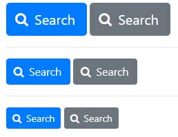
Làm thế nào căn chỉnh modal Bootstrap theo chiều dọc ở giữa?
Trả lời: Dùng thuộc tính CSS margin-top
Mặc định, cửa sổ Bootstrap được căn chỉnh về phía đầu của trang cùng một số lề. Thế nhưng bạn có thể căn chỉnh nó về giữa trang theo chiều dọc bằng một mẹo JavaScript đơn giản như được mô tả ở ví dụ bên dưới. Giải pháp này sẽ căn chỉnh linh động modal và luôn giữ nó ở trung tâm của trang ngay cả khi người dùng chỉnh lại kích thước của cửa sổ trình duyệt.
Ví dụ:
<!DOCTYPE html>
<html lang="en">
<head>
<meta charset="utf-8">
<title>Center Align Bootstrap Modal Vertically</title>
<link rel="stylesheet" href="https://stackpath.bootstrapcdn.com/bootstrap/4.5.0/css/bootstrap.min.css">
<script src="https://code.jquery.com/jquery-3.5.1.min.js"></script>
<script src="https://stackpath.bootstrapcdn.com/bootstrap/4.5.0/js/bootstrap.min.js"></script>
<script>
$(document).ready(function(){
function alignModal(){
var modalDialog = $(this).find(".modal-dialog");
// Applying the top margin on modal to align it vertically center
modalDialog.css("margin-top", Math.max(0, ($(window).height() - modalDialog.height()) / 2));
}
// Align modal when it is displayed
$(".modal").on("shown.bs.modal", alignModal);
// Align modal when user resize the window
$(window).on("resize", function(){
$(".modal:visible").each(alignModal);
});
});
</script>
<style>
.bs-example{
margin: 20px;
}
</style>
</head>
<body>
<div class="bs-example">
<!-- Button HTML (to Trigger Modal) -->
<a href="#myModal" class="btn btn-lg btn-primary" data-toggle="modal">Mở Modal mẫu</a>
<!-- Modal HTML -->
<div id="myModal" class="modal">
<div class="modal-dialog">
<div class="modal-content">
<div class="modal-header">
<h5 class="modal-title">Xác nhận</h5>
<button type="button" class="close" data-dismiss="modal">×</button>
</div>
<div class="modal-body">
<p>Bạn có muốn lưu thay đổi tài liệu Quantrimang.com trước khi đóng?</p>
<p class="text-warning"><small>Nếu không lưu, thay đổi vừa thực hiện sẽ bị mất.</small></p>
</div>
<div class="modal-footer">
<button type="button" class="btn btn-secondary" data-dismiss="modal">Đóng</button>
<button type="button" class="btn btn-primary">Save changes</button>
</div>
</div>
</div>
</div>
</div>
</body>
</html>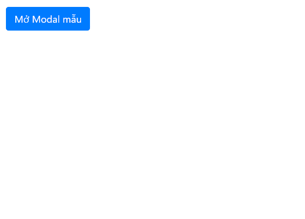
Làm thế nào nhúng video YouTube vào modal Bootstrap?
Trả lời: Chèn code YouTube vào trong body của modal
Bạn có thể dễ dàng nhúng hoặc đặt video YouTube vào bên trong một modal Boostrap như khi làm trên các trang web bình thường. Chỉ cần lấy code để nhúng video YouTube và đặt nó vào trong phần tử .modal-body. Thế nhưng, ở đây có một vấn đề nhỏ. Clip YouTube không tự động dừng khi bạn đóng cửa sổ modal. Nó vẫn sẽ phát ở trên nền hệ thống.
Để giải quyết vấn đề này, bạn chỉ cần chuyển đổi giá trị url của iframe clip YouTube - thuộc tính src bằng jQuery. Ví dụ:
<!DOCTYPE html>
<html lang="en">
<head>
<meta charset="utf-8">
<title>Example of Embedding YouTube Video inside Bootstrap Modal</title>
<link rel="stylesheet" href="https://stackpath.bootstrapcdn.com/bootstrap/4.5.0/css/bootstrap.min.css">
<script src="https://code.jquery.com/jquery-3.5.1.min.js"></script>
<script src="https://stackpath.bootstrapcdn.com/bootstrap/4.5.0/js/bootstrap.min.js"></script>
<style>
.bs-example{
margin: 20px;
}
.modal-dialog iframe{
margin: 0 auto;
display: block;
}
</style>
<script>
$(document).ready(function(){
/* Get iframe src attribute value i.e. YouTube video url
and store it in a variable */
var url = $("#cartoonVideo").attr('src');
/* Assign empty url value to the iframe src attribute when
modal hide, which stop the video playing */
$("#myModal").on('hide.bs.modal', function(){
$("#cartoonVideo").attr('src', '');
});
/* Assign the initially stored url back to the iframe src
attribute when modal is displayed again */
$("#myModal").on('show.bs.modal', function(){
$("#cartoonVideo").attr('src', url);
});
});
</script>
</head>
<body>
<div class="bs-example">
<!-- Button HTML (to Trigger Modal) -->
<a href="#myModal" class="btn btn-primary btn-lg" data-toggle="modal">Mở modal mẫu</a>
<!-- Modal HTML -->
<div id="myModal" class="modal fade">
<div class="modal-dialog">
<div class="modal-content">
<div class="modal-header">
<h5 class="modal-title">YouTube Video</h5>
<button type="button" class="close" data-dismiss="modal">×</button>
</div>
<div class="modal-body">
<div class="embed-responsive embed-responsive-16by9">
<iframe id="cartoonVideo" class="embed-responsive-item" width="560" height="315" src="https://www.youtube.com/embed/z_-roOHa5Ig" allowfullscreen></iframe>
</div>
</div>
</div>
</div>
</div>
</div>
</body>
</html>
Cách thay đổi chiều rộng mặc định của box modal trong Bootstrap như thế nào?
Trả lời: Thiết lập chiều rộng cho phần tử bằng .modal-dialog
Mặc định, modal Bootstrap có sẵn 4 kiểu khác nhau - nhỏ, mặc định, lớn và cực lớn. Tuy nhiên, nếu vẫn muốn tùy chỉnh kích thước của cửa sổ modal này, bạn có thể ghi đè thuộc tính width CSS của class .modal-dialog để chỉnh lại kích thước modal mặc định.
Tương tự, bạn có thể ghi đè thuộc tính width của class .modal-sm, .modal-lg và .modal-xl để chỉnh lại kích thước từng hộp thoại modal tương ứng từ nhỏ, lớn và cực lớn.
Ví dụ sau sẽ cho bạn biết cách thay đổi chiều rộng của modal mặc định:
<!DOCTYPE html>
<html lang="en">
<head>
<meta charset="utf-8">
<title>Example of Resizing the Bootstrap Modals</title>
<link rel="stylesheet" href="https://stackpath.bootstrapcdn.com/bootstrap/4.5.0/css/bootstrap.min.css">
<script src="https://code.jquery.com/jquery-3.5.1.min.js"></script>
<script src="https://stackpath.bootstrapcdn.com/bootstrap/4.5.0/js/bootstrap.min.js"></script>
<style>
@media screen and (min-width: 676px) {
.modal-dialog {
max-width: 600px; /* New width for default modal */
}
}
</style>
</head>
<body>
<div class="m-4">
<!-- Button HTML (to Trigger Modal) -->
<a href="#defaultModal" class="btn btn-lg btn-primary" data-toggle="modal">Hiện modal mặc định</a>
<!-- Default Modal HTML -->
<div id="defaultModal" class="modal">
<div class="modal-dialog">
<div class="modal-content">
<div class="modal-header">
<h5 class="modal-title">Modal mặc định</h5>
<button type="button" class="close" data-dismiss="modal">×</button>
</div>
<div class="modal-body">
<p>Kích thước modal mặc định đã thay đổi sang 600px. Giờ nó rộng hơn 100px so với modal 500px trước đó.</p>
</div>
<div class="modal-footer">
<button type="button" class="btn btn-primary" data-dismiss="modal">Ok, tôi hiểu</button>
</div>
</div>
</div>
</div>
</div>
</body>
</html>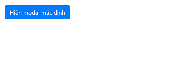
Làm thế nào chèn nút đóng trong Bootstrap popover?
Trả lời: Dùng tùy chọn HTML của popover.
Bạn có thể dùng tùy chọn html của Bootstrap popover để chèn nút đóng vào bên trong cửa sổ bật lên. Ngoài ra, bạn có thể dùng phương thức .popover('hide') để ẩn cửa sổ bật lên khi người dùng click vào nút đóng. Hãy thử mẫu ví dụ sau và xem kết quả:
<!DOCTYPE html>
<html lang="en">
<head>
<meta charset="utf-8">
<title>Bootstrap Popover with Close Button</title>
<link rel="stylesheet" href="css/bootstrap.min.css">
<script src="js/jquery-3.5.1.min.js"></script>
<script src="js/popper.min.js"></script>
<script src="js/bootstrap.min.js"></script>
<script>
$(document).ready(function(){
$('[data-toggle="popover"]').popover({
placement : 'top',
html : true,
title : 'User Info <a href="#" class="close" data-dismiss="alert">×</a>',
content : '<div class="media"><img src="images/avatar-tiny.jpg" class="mr-3" alt="Sample Image"><div class="media-body"><h5 class="media-heading">Jhon Carter</h5><p>Excellent Bootstrap popover! I really love it.</p></div></div>'
});
$(document).on("click", ".popover .close" , function(){
$(this).parents(".popover").popover('hide');
});
});
</script>
<style>
.wrapper{
margin: 200px 150px 0;
}
.popover-title .close{
position: relative;
bottom: 3px;
}
</style>
</head>
<body>
<div class="wrapper">
<button type="button" class="btn btn-primary" data-toggle="popover">Click Me</button>
</div>
</body>
</html>Ngoài ra, nếu muốn hiện/ẩn popover Bootstrap bằng trỏ chuột, thay vì click, bạn chỉ cần dùng tùy chọn trigger. Ví dụ:
<!DOCTYPE html>
<html lang="en">
<head>
<meta charset="utf-8">
<title>Display Bootstrap Popover on Mouse Hover</title>
<link rel="stylesheet" href="css/bootstrap.min.css">
<script src="js/jquery-3.5.1.min.js"></script>
<script src="js/popper.min.js"></script>
<script src="js/bootstrap.min.js"></script>
<script>
$(document).ready(function(){
    $('[data-toggle="popover"]').popover({
        placement : 'top',
        trigger : 'hover'
    });
});
</script>
<style>
	.wrapper{
    	margin: 150px 50px;
    }
</style>
</head>
<body>
<div class="wrapper">
    <button type="button" class="btn btn-primary" data-toggle="popover" title="Popover title" data-content="Default popover">Popover</button>
    <button type="button" class="btn btn-success" data-toggle="popover" title="Popover title" data-content="Another popover">Another popover</button>
    <button type="button" class="btn btn-info" data-toggle="popover" title="Popover title" data-content="A larger popover to demonstrate the max-width of the Bootstrap popover.">Large popover</button>
    <button type="button" class="btn btn-warning" data-toggle="popover" title="Popover title" data-content="The last popover!">Last popover</button>
</div>
</body>
</html>
Trên đây là một số câu hỏi thường gặp về cách dùng Bootstrap. Nếu có bất kỳ câu hỏi về Bootstrap, hãy thoải mái chia sẻ với độc giả Quantrimang.com và cùng nhau tìm ra câu trả lời nhé!


 Bootstrap
 AI
AI
 Copilot
 Grok
Grok
 Thư viện Prompt
 Hướng dẫn AI
 Công nghệ
 Ứng dụng
 Hệ thống
 Game - Trò chơi
 iPhone
 Android
 Làng Công nghệ
 Học CNTT
 Hàm Excel
 Học Python
 Download
 Video
Video
 Cuộc sống
 Khoa học