 AI
AI
 Hướng dẫn AI
 Claude
 ChatGPT
 Gemini
 Thư viện Prompt
 Công nghệ
 Học IT
 Tiện ích

Bootstrap là một framework CSS tuyệt vời, có thể giúp bạn tạo web thời thượng và bóng bẩy. Một số lập trình viên và đội ngũ phát triển thấy rằng viết code trong Bootstrap dễ chỉnh sửa hơn CSS thông thường.
Thế nhưng nếu dùng Bootstrap với các kiểu mặc định, thì mọi trang web trông sẽ giống nhau. Thế giới Internet cũng vì thế mà trở nên nhạt nhẽo. Thật may, Bootstrap cũng có khả năng tùy biến cao.
Cách tùy biến Bootstrap
Nếu mới bắt đầu dùng Bootstrap, bạn có thể tùy biến nó với một stylesheet CSS tùy chỉnh. Tính đặc hiệu CSS ở đây rất quan trọng. Bạn viết CSS tùy chỉnh với cùng độ đặc hiệu hoặc cao hơn và liên kết tới nó trong phần tiêu đề của index.html sau khi dòng này link tới Bootstrap CSS gốc.
<!-- index.html -->
<head>

<link rel="stylesheet" href="./node_modules/bootstrap/dist/css/bootstrap.min.css">
<!-- custom CSS should come after Bootstrap CSS -->
<link rel="stylesheet" href="./custom.css"

</head>
Điều này ổn đối với tinh chỉnh nhỏ nhưng với các dự án lớn hơn, việc này có thể mất nhiều thời gian và dư thừa các kiểu khai báo. Thực tế, bạn có một cách khác, nhẹ nhàng hơn.
Cách dùng Sass với Bootstrap
Giải pháp ở đây là dùng Sass - một chương trình tiền xử lý CSS. Sass được biên dịch thành CSS trước khi nó được sử dụng trên các trang web.
Kể từ phiên bản 4, Bootstrap chỉ dùng Sass. Mã nguồn này dành cho Bootstrap framework 4 và 5 được viết hoàn toàn bằng Sass.
Sass đi kèm với hai cú pháp. Cái cũ hơn sử dụng thụt đầu dòng và cú pháp SCSS mới hơn (SCSS cho Sassy CSS) sử dụng dấu ngoặc nhọn giống như CSS.
SCSS là một siêu tập hợp của CSS. Vì vậy, mã CSS được lưu với phần mở rộng .scss (hoặc SCSS xen kẽ với CSS) cũng là mã Sass hợp lệ.
Hướng dẫn này dùng phiên bản SCSS. Dù style ở đây là gì, trình biên dịch Sass đều có thể chuyển nó thành vanilla CSS để sử dụng trên trình duyệt.
Hai việc sẽ làm trong hướng dẫn này bao gồm:
- Thay đổi màu nền chính và phụ.
- Thay đổi breakpoint media mặc định mà Bootstrap sử dụng.
Khi bạn có thể làm những việc trên, thực hiện những tùy biến khác sẽ dễ dàng hơn.
Điều kiện cần có:
- Node.js với npm hoặc yarn
- Một trình chỉnh sửa code, ưu tiên VS Code
- Hiểu biết cơ bản về Sass
Sau khi cài đặt Node.js, chúng ta sẽ dùng phiên bản npm:
npm i bootstrapTất nhiên, bạn cũng cần cài trình biên dịch Sass nếu chưa có. Bạn chỉ cần tải gói dart-sass, giải nén và thêm nó vào đường dẫn (các biến môi trường). Bạn có một gói npm sass và extension Live Sass Compiler VS Code với hơn 2 triệu lượt tải. Bạn thoải mái dùng bất kỳ trình biên dịch yêu thích.
Ví dụ này dùng npm package: sass.
Sau khi tải Bootstrap, trình biên dịch Sass, trong danh mục node-modules, có một mục mang tên bootstrap, bên trong nó là ba thư mục dist, js và scss. Tất cả CSS được biên dịch trong dist. Code Bootstrap JavaScript nằm trong js. Tất cả file Sass đều nằm ở thư mục scss.
Cách thay đổi màu nền chính và phụ
Ý tưởng ở đây là ghi đè lên file .scss và biên dịch lại chúng. Theo hướng dẫn chính thức của Bootstrap, bạn nên hạn chế thay đổi file bootstrap gốc. Vì thế, ở đây sẽ tạo một stylesheet custom.scss.
Chúng ta sẽ nhập tất cả Bootstrap trong file custom.css:
//custom.scss

@import "../node_modules/bootstrap/scss/bootstrap";
Các biến có hậu tố !default (một flag Sass) trong Bootstrap. Flag !default cho biết trình biên dịch được thiết lập chỉ đặt giá trị nếu giá trị đó không được xác định.
Vì thế, chúng ta sẽ thiết lập các biến trước mục @import để sau này, trình biên dịch sẽ chọn giá trị được cung cấp thay vì mặc định.
//custom.scss

$primary: teal;
$secondary: green;

@import "../node_modules/bootstrap/scss/bootstrap";
Bạn cũng cần một file HTML để xem trước kết quả.
<!-- index.html -->
<!DOCTYPE html>
<html lang="en">
<head>
<meta charset="UTF-8">
<meta http-equiv="X-UA-Compatible" content="IE=edge">
<meta name="viewport" content="width=device-width, initial-scale=1.0">
<title>Welcome! Customize Bootstrap with Sass</title>
<link rel="stylesheet" href="./node_modules/bootstrap/dist/css/bootstrap.min.css"
</head>
<body>
<div class="container" >
<div class="row">
<nav class="navbar navbar-expand-lg navbar-light bg-primary">
<div class="container-fluid">
<a class="navbar-brand" href="#">Customize Bootstrap</a>
<button class="navbar-toggler" type="button" data-bs-toggle="collapse" data-bs-target="#navbarSupportedContent" aria-controls="navbarSupportedContent" aria-expanded="false" aria-label="Toggle navigation">
<span class="navbar-toggler-icon"></span>
</button>
<div class="collapse navbar-collapse" id="navbarSupportedContent">
<ul class="navbar-nav me-auto mb-2 mb-lg-0">
<li class="nav-item">
<a class="nav-link active" aria-current="page" href="#">Home</a>
</li>
<li class="nav-item">
<a class="nav-link" href="#">Link</a>
</li>
<li class="nav-item dropdown">
<a class="nav-link dropdown-toggle" href="#" id="navbarDropdown" role="button" data-bs-toggle="dropdown" aria-expanded="false">
Dropdown
</a>
<ul class="dropdown-menu" aria-labelledby="navbarDropdown">
<li><a class="dropdown-item" href="#">Action</a></li>
<li><a class="dropdown-item" href="#">Another action</a></li>
<li><hr class="dropdown-divider"></li>
<li><a class="dropdown-item" href="#">Something else here</a></li>
</ul>
</li>
<li class="nav-item">
<a class="nav-link disabled" href="#" tabindex="-1" aria-disabled="true">Disabled</a>
</li>
</ul>
<form class="d-flex">
<input class="form-control me-2" type="search" placeholder="Search" aria-label="Search">
<button class="btn btn-outline-success" type="submit">Search</button>
</form>
</div>
</div>
</nav>
<div class="container">
<div class="row">
<div class="col-xl pt-3">
Lorem ipsum dolor sit amet consectetur adipisicing elit. Vero, laborum hic, quia maiores animi nobis eligendi est eos saepe architecto reiciendis! Aliquam inventore distinctio reprehenderit corporis amet assumenda officiis dolorem, animi delectus sunt dolor commodi. Adipisci nam nemo labore eligendi quas, rem ipsum iusto eveniet itaque vero necessitatibus! Quas, cupiditate tempora unde nam exercitationem libero aut labore deserunt nesciunt voluptate dignissimos quis porro reprehenderit maiores excepturi, esse, nisi dolores sit tenetur voluptatum corrupti alias provident pariatur? Quam illo unde autem, fugit numquam dolores, odio sed rem saepe exercitationem fuga, nisi soluta sunt officiis! Similique, vero repudiandae quae dignissimos fuga natus!
</div>
<div class="col-xl pt-3 ">
Lorem ipsum dolor sit, amet consectetur adipisicing elit. Numquam, aliquid, cumque nisi tenetur similique labore repudiandae voluptas qui hic blanditiis beatae sapiente autem dolore! Quam, cupiditate nostrum laboriosam blanditiis vel ratione, repellat, incidunt modi tempore soluta ab nesciunt? Ab similique illum suscipit exercitationem et, aut quisquam neque atque recusandae rem delectus facilis. Magnam rerum fugit minus explicabo vel! Hic quibusdam laudantium dolorum, pariatur ipsam veritatis voluptate animi, nesciunt dolorem autem dicta. Debitis quae nam dicta autem ipsum mollitia! Ipsum ipsa, molestias fugiat officiis aut illum ullam architecto maxime labore vitae. Ipsum quos neque rerum, esse iste quo explicabo eos ipsa?
</div>
</div>
</div>
<div class="mt-5 pt-5 mb-5 text-center">
<button type="button" class="btn btn-primary">Primary</button>
<button type="button" class="btn btn-secondary">Secondary</button>
<button type="button" class="btn btn-success">Success</button>
<button type="button" class="btn btn-danger">Danger</button>
<button type="button" class="btn btn-warning">Warning</button>
<button type="button" class="btn btn-info">Info</button>
<button type="button" class="btn btn-light">Light</button>
<button type="button" class="btn btn-dark">Dark</button>
<button type="button" class="btn btn-link">Link</button>
</div>
</div>
</div>
</body>
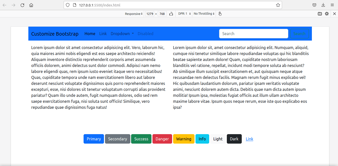
</html>Sass ở đây vẫn chưa được biên dịch. Để thấy các kiểu mặc định, chạy Live Server. Nếu chưa cài đặt nó, bạn có thể tải miễn phí tiện ích mở rộng này từ extension VS Code. Kết quả nhận được như sau:
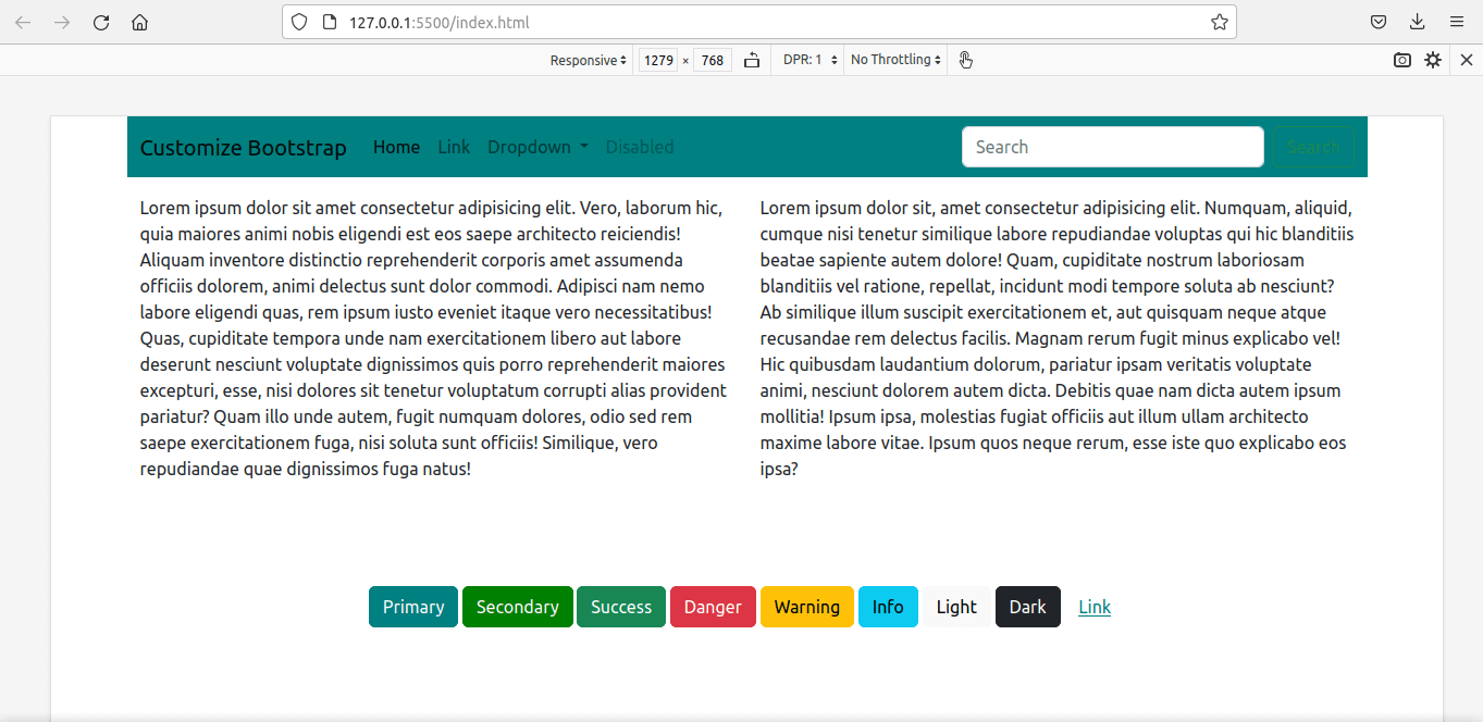
Giờ là lúc biên dịch file Sass tùy chỉnh. Công thức biên dịch rất đơn giản: Chỉ định thư mục nguồn và thư mục đích được phân tách bằng dấu hai chấm.
Chúng ta có file custom.css trong thư mục cùng tên:
sass custom_scss/custom.scss:assets/css/custom_bootstrap.cssSau khi biên dịch lại, chúng ta có bootstrap đã tùy biến trong file assets/css/custom_bootstrap.css.
Thay vì file bootstrap mặc định, chúng ta sẽ dùng stylesheet bootstrap tùy biến này:
<!-- index.html -->
<head>

<link rel="stylesheet" href="./assets/css/custom_bootstrap.css"> `

</head>
Chạy lại Live Server.
Chúng ta sẽ có trang web được tùy biến với các style mới.
Cách thay đổi các breakpoint grid trong Bootstrap 5
Chúng ta giờ sẽ tùy biến các breakpoint media, đồng thời, xác định lại cả container-max-widths.
Cách dễ nhất là ghi đè lên các biến:
$primary: teal;
$secondary:green;

$grid-breakpoints: (
xs: 0,
sm: 576px,
md: 768px,
lg: 992px,
xl: 1280px,
xxl: 1600px
);

$container-max-widths: (
sm: 540px,
md: 720px,
lg: 960px,
xl: 1220px,
xxl: 1520px
);

@import '../node_modules/bootstrap/scss/bootstrap'
Dùng hàm map-merge() sẽ tốt hơn trong trường hợp này. Đầu tiên, chúng ta phải nhập các hàm trước trong file custom.scss để làm map.merge() có sẵn.
Chúng ta cũng phải nhập các biến bởi $grid-breakpoints được xác định ở đó.
//custom.scss

$primary: teal;
$secondary: green;

@import '../node_modules/bootstrap/scss/functions';
@import '../node_modules/bootstrap/scss/variables';
Đây là code:
//custom.scss
$primary: teal;
$secondary: green;
//We have to import the functions first to use map.merge()
@import '../node_modules/bootstrap/scss/functions';
// We have to import the variables beforehand to
//use the variable $grid-breakpoints.
// Otherwise, compiler will show error - '$grid-breakpoints
//undefined.'
@import '../node_modules/bootstrap/scss/variables';
$new-breakpoints: (
xl: 1280px,
xxl:1600px
);
$grid-breakpoints: map-merge($grid-breakpoints, $new-breakpoints);
$new-container-max-widths: (
xl: 1220px,
xxl:1520px
);
$container-max-widths: map-merge($container-max-widths, $new-container-max-widths);
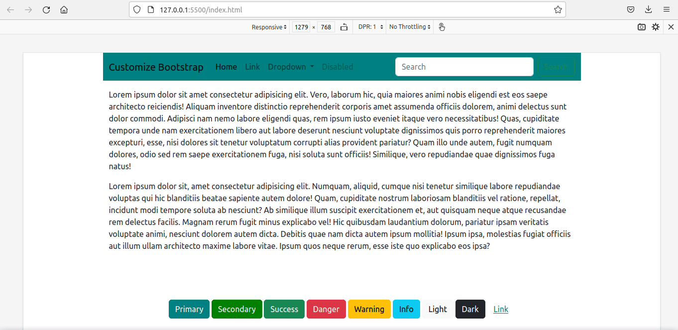
@import "../node_modules/bootstrap/scss/bootstrap";Biên dịch lại và dùng file mới nhất thay cho file cũ:
<link rel="stylesheet" href="./assets/css/custom_bootstrap.css">Đây là kết quả cuối cùng:
Trên đây là cách tùy biến Bootstrap với Sass. Hi vọng bài viết hữu ích với các bạn.


 Bootstrap
 AI
AI
 Copilot
 Grok
Grok
 Thư viện Prompt
 Hướng dẫn AI
 Công nghệ
 Ứng dụng
 Hệ thống
 Game - Trò chơi
 iPhone
 Android
 Làng Công nghệ
 Học CNTT
 Hàm Excel
 Học Python
 Download
 Video
Video
 Cuộc sống
 Khoa học