 Công nghệ
  AI
AI  Windows
  iPhone
  Android
  Học IT
  Download
  Tiện ích
  Khoa học
  Game
Game  Làng CN
  Ứng dụng
Việc tạo logo rất thú vị. Trong bài viết hôm nay, Quantrimang.com sẽ chỉ cho bạn cách tạo không chỉ một, mà là hai biến thể của logo Gmail chỉ bằng CSS3.
Cách tạo logo Gmail 1
Logo đầu tiên này đơn giản và khá dễ tạo. Hãy bắt đầu với việc khởi động trình soạn thảo code yêu thích của bạn và nhập các code HTML sau đây, rồi lưu chúng thành logo-gmail.html.
<html>
<head>
<title>Gmail CSS Logo</title>
<style type='text/css'>
</style>
</head>
<body>
<span class='gmail-logo'>
<span class='gmail-box'> </span>
</span><!-- End .gmail-logo -->
</body>
</html>Thêm các kiểu CSS sau giữa <style> </style> để reset lại những giá trị CSS mặc định.
.gmail-logo,
.gmail-logo *,
.gmail-logo *:before,
.gmail-logo *:after {
margin:0;
padding:0;
background:transparent;
border:0;
outline:0;
display:block;
font:normal normal 0/0 serif;
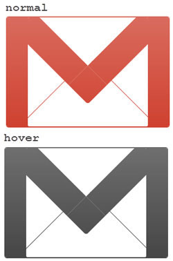
}Những code CSS sau đây sẽ tạo ra logo Gmail màu đỏ nền đỏ và các cạnh được làm tròn.
.gmail-logo {
  margin:110px auto;
  background:rgb(201, 44, 25);
  width:600px;
  height:400px;
  border-top:4px solid rgb(201, 44, 25);
  border-bottom:4px solid rgb(201, 44, 25);
  border-radius:10px;
  -moz-border-radius:10px;
  -webkit-border-radius:10px;
  }
Sau đó, hãy tiến hành tạo hộp trắng trong nền đỏ.
.gmail-logo .gmail-box {
  overflow:hidden;
  float:left;
  width:440px;
  height:400px;
  margin:0 0 0 80px;
  background:white;
  border-radius:5px;
  -moz-border-radius:5px;
  -webkit-border-radius:5px;
  }
Để tạo hiệu ứng "M" màu đỏ, trước tiên bạn hãy tạo một hộp có viền màu đỏ.
.gmail-logo .gmail-box:before {
  position:relative;
  content:'';
  z-index:1;
  background:white;
  float:left;
  width:320px;
  height:320px;
  border:100px solid rgb(201, 44, 25);
  margin:-310px 0 0 -40px;
  border-radius:10px;
  -moz-border-radius:10px;
  -webkit-border-radius:10px;
  -moz-transform:rotate(45deg);
  -webkit-transform:rotate(45deg);
  -o-transform:rotate(45deg);
  }
Sau đó, tiến hành che giấu các cạnh thừa để có một chữ "M" hoàn chỉnh màu đỏ.
.gmail-logo .gmail-box {
  overflow:hidden;
  }
Bây giờ, thêm hai đường viền màu đỏ mảnh, sao cho logo giống hình chiếc phong bì.
.gmail-logo .gmail-box:after {
  content:'';
  float:left;
  width:360px;
  height:360px;
  border:2px solid rgb(201, 44, 25);
  margin:10px 0 0 40px;
  -o-transform:rotate(45deg);
  -webkit-transform:rotate(45deg);
  -moz-transform:rotate(45deg);
  }
Mọi thao tác đã gần hoàn tất. Chỉ cầm thêm một số gradient cho hình phong bì màu đỏ này nữa mà thôi.
.gmail-logo:after {
  content:'';
  position:relative;
  z-index:2;
  content:'';
  float:left;
  margin-top:-404px;
  width:600px;
  height:408px;
  display:block;
  background:
    -moz-linear-gradient(top, rgba(255, 255, 255, 0.3) 0%,
    /* rgba(255, 255, 255, 0.3) 30%, */
    rgba(255, 255, 255, 0.1) 100%);
  background:-o-linear-gradient(top, rgba(255, 255, 255, 0.3) 0%,
    /* rgba(255, 255, 255, 0.2) 30%, */
    rgba(255, 255, 255, 0.1) 100%);
  background:-webkit-gradient(
    linear, left top, left bottom, color-stop(0%,
    rgba(255, 255, 255, 0.3)),
    /* color-stop(30%, rgba(255, 255, 255, 0.2)), */
    color-stop(100%, rgba(255, 255, 255, 0.1)));
  }
Cuối cùng nhưng không kém phần quan trọng, hãy cho logo một màu khác khi di chuột qua. Thêm HTML DOCTYPE sau đây trước <html>.
<!DOCTYPE HTML PUBLIC "-//W3C//DTD XHTML 1.0 Strict//EN" "http://www.w3.org/TR/xhtml1/DTD/xhtml1-strict.dtd">
Và các kiểu CSS sau trước </style>.
.gmail-logo:hover {
  background:#313131;
  border-color:#313131;
  /* cursor:pointer; */
  }
.gmail-logo:hover .gmail-box:before {
  border-color:#313131;
  }
.gmail-logo:hover .gmail-box:after {
  border-color:#313131;
  border-bottom-color:#fff;
  border-right-color:#fff;
  }
Cách tạo logo Gmail 2
Tiếp theo, bài viết sẽ tạo logo Gmail từ một góc nhìn khác với hiệu ứng 3D nhỏ. Ví dụ sẽ bắt đầu với HTML markup cơ bản.
<html>
<head>
<title>Gmail logo 2 </title>
<style type="text/css">
</style>
</head>
<body>
<span id='gmail-logo2'>
<span class='element1'> </span>
<span class='element2'> </span>
<span class='element3'> </span>
<span class='element4'> </span>
<span class='element5'> </span>
</span>
</body>
</html>Vì logo có một phối cảnh khác, nên ta sẽ bắt đầu bằng cách xoay nó một chút và tạo các layer cần thiết (gọi là các phần tử) theo trình tự.
#gmail-logo2 {
  margin:0 auto;
  display:block;
  width:380px;
  height:290px;
  -moz-transform:rotate(6deg);
  -webkit-transform:rotate(6deg);
  -o-transform:rotate(6deg);
  transform:rotate(6deg);
  }
#gmail-logo2 .element1 {
  display:block;
  width:380px;
  height:290px;
  }
#gmail-logo2 .element2,
#gmail-logo2 .element3,
#gmail-logo2 .element4,
#gmail-logo2 .element5  {
  float:left;
  display:block;
  width:380px;
  height:290px;
  margin:-290px 0 0 0;
  }
Định kiểu cho .element1::before
#gmail-logo2 .element1::before {
  content:'';
  position:relative;
  margin:2px 0 0 14px;
  float:left;
  display:block;
  background:rgb(201, 44, 25);
  width:30px;
  height:276px;
  -moz-transform:rotate(3deg);
  -webkit-transform:rotate(3deg);
  -o-transform:rotate(3deg);
  transform:rotate(3deg);
  border-radius:22px 0 0 20px;
  -moz-border-radius:22px 0 0 20px;
  -webkit-border-radius:22px 0 0 20px;
  box-shadow:
    -1px 1px 0 rgb(109, 10, 0),
    -2px 2px 0 rgb(109, 10, 0),
    -3px 3px 0 rgb(109, 10, 0),
    -4px 4px 0 rgb(109, 10, 0),
    -5px 5px 0 rgb(109, 10, 0),
    -6px 6px 0 rgb(109, 10, 0);
  -webkit-box-shadow:
    -1px 1px 0 rgb(109, 10, 0),
    -2px 2px 0 rgb(109, 10, 0),
    -3px 3px 0 rgb(109, 10, 0),
    -4px 4px 0 rgb(109, 10, 0),
    -5px 5px 0 rgb(109, 10, 0),
    -6px 6px 0 rgb(109, 10, 0);
  -moz-box-shadow:
    -1px 1px 0 rgb(109, 10, 0),
    -2px 2px 0 rgb(109, 10, 0),
    -3px 3px 0 rgb(109, 10, 0),
    -4px 4px 0 rgb(109, 10, 0),
    -5px 5px 0 rgb(109, 10, 0),
    -6px 6px 0 rgb(109, 10, 0);
  }
Định kiểu cho .element1::after
#gmail-logo2 .element1::after {
  content:'';
  position:relative;
  margin:40px 5px 0 0;
  float:right;
  display:block;
  background:rgb(201, 44, 25);
  width:30px;
  height:238px;
  -moz-transform:rotate(3deg);
  -webkit-transform:rotate(3deg);
  -o-transform:rotate(3deg);
  transform:rotate(3deg);
  border-radius:0 18px 26px 0;
  -webkit-border-radius:0 18px 26px 0;
  -moz-border-radius:0 18px 26px 0;
  box-shadow:
    -1px 1px 0 rgb(109, 10, 0),
    -2px 2px 0 rgb(109, 10, 0),
    -3px 3px 0 rgb(109, 10, 0),
    -4px 4px 0 rgb(109, 10, 0),
    -5px 5px 0 rgb(109, 10, 0),
    -6px 6px 0 rgb(109, 10, 0),
    -6px 7px 0 rgb(109, 10, 0);
  -moz-box-shadow:
    -1px 1px 0 rgb(109, 10, 0),
    -2px 2px 0 rgb(109, 10, 0),
    -3px 3px 0 rgb(109, 10, 0),
    -4px 4px 0 rgb(109, 10, 0),
    -5px 5px 0 rgb(109, 10, 0),
    -6px 6px 0 rgb(109, 10, 0),
    -6px 7px 0 rgb(109, 10, 0);
  -webkit-box-shadow:
    -1px 1px 0 rgb(109, 10, 0),
    -2px 2px 0 rgb(109, 10, 0),
    -3px 3px 0 rgb(109, 10, 0),
    -4px 4px 0 rgb(109, 10, 0),
    -5px 5px 0 rgb(109, 10, 0),
    -6px 6px 0 rgb(109, 10, 0),
    -6px 7px 0 rgb(109, 10, 0);
  }
Định kiểu cho .element2::before
#gmail-logo2 .element2::before {
  content:'';
  margin:22px 0 0 48px;
  float:left;
  display:block;
  background:rgb(201, 44, 25);
  width:315px;
  height:14px;
  -moz-transform:rotate(6.8deg);
  -webkit-transform:rotate(6.8deg);
  -o-transform:rotate(6.8deg);
  transform:rotate(6.8deg);
  box-shadow:
    0 1px 0 rgb(109, 10, 0),
    0 2px 0 rgb(109, 10, 0),
    0 3px 0 rgb(109, 10, 0),
    0 4px 0 rgb(109, 10, 0),
    0 5px 0 rgb(109, 10, 0),
    -6px 6px 0 rgb(109, 10, 0);
  -webkit-box-shadow:
    0 1px 0 rgb(109, 10, 0),
    0 2px 0 rgb(109, 10, 0),
    0 3px 0 rgb(109, 10, 0),
    0 4px 0 rgb(109, 10, 0),
    0 5px 0 rgb(109, 10, 0),
    -6px 6px 0 rgb(109, 10, 0);
  -moz-box-shadow:
    0 1px 0 rgb(109, 10, 0),
    0 2px 0 rgb(109, 10, 0),
    0 3px 0 rgb(109, 10, 0),
    0 4px 0 rgb(109, 10, 0),
    0 5px 0 rgb(109, 10, 0),
    -6px 6px 0 rgb(109, 10, 0);
  }
Định kiểu cho .element2::after
#gmail-logo2 .element2::after {
  content:'';
  position:relative;
  margin:230px 0 0 36px;
  float:left;
  display:block;
  background:rgb(201, 44, 25);
  width:310px;
  height:12px;
  box-shadow:
    0 1px 0 rgb(109, 10, 0),
    0 2px 0 rgb(109, 10, 0),
    0 3px 0 rgb(109, 10, 0),
    0 4px 0 rgb(109, 10, 0),
    0 5px 0 rgb(109, 10, 0),
    -6px 6px 0 rgb(109, 10, 0);
  -webkit-box-shadow:
    0 1px 0 rgb(109, 10, 0),
    0 2px 0 rgb(109, 10, 0),
    0 3px 0 rgb(109, 10, 0),
    0 4px 0 rgb(109, 10, 0),
    0 5px 0 rgb(109, 10, 0),
    -6px 6px 0 rgb(109, 10, 0);
  -moz-box-shadow:
    0 1px 0 rgb(109, 10, 0),
    0 2px 0 rgb(109, 10, 0),
    0 3px 0 rgb(109, 10, 0),
    0 4px 0 rgb(109, 10, 0),
    0 5px 0 rgb(109, 10, 0),
    -6px 6px 0 rgb(109, 10, 0);
  }
Định kiểu cho .element3::before
#gmail-logo2 .element3::before {
  content:'';
  position:relative;
  margin:8px 0 0 42px;
  float:left;
  display:block;
  background:rgb(201, 44, 25);
  width:42px;
  height:268px;
  -moz-transform:rotate(3deg);
  -webkit-transform:rotate(3deg);
  -o-transform:rotate(3deg);
  transform:rotate(3deg);
  }
Định kiểu cho .element3::after
#gmail-logo2 .element3::after {
  content:'';
  position:relative;
  margin:40px 32px 0 0;
  float:right;
  display:block;
  background:rgb(201, 44, 25);
  width:22px;
  height:236px;
  -moz-transform:rotate(3.0deg);
  -webkit-transform:rotate(3.0deg);
  -o-transform:rotate(3.0deg);
  transform:rotate(3.0deg);
  box-shadow:
    0 1px 0 rgb(109, 10, 0),
    0 2px 0 rgb(109, 10, 0),
    0 3px 0 rgb(109, 10, 0),
    0 4px 0 rgb(109, 10, 0),
    0 5px 0 rgb(109, 10, 0),
    -6px 6px 0 rgb(109, 10, 0);
  -webkit-box-shadow:
    0 1px 0 rgb(109, 10, 0),
    0 2px 0 rgb(109, 10, 0),
    0 3px 0 rgb(109, 10, 0),
    0 4px 0 rgb(109, 10, 0),
    0 5px 0 rgb(109, 10, 0),
    -6px 6px 0 rgb(109, 10, 0);
  -moz-box-shadow:
    0 1px 0 rgb(109, 10, 0),
    0 2px 0 rgb(109, 10, 0),
    0 3px 0 rgb(109, 10, 0),
    0 4px 0 rgb(109, 10, 0),
    0 5px 0 rgb(109, 10, 0),
    -6px 6px 0 rgb(109, 10, 0);
  }
Định kiểu cho .element4::before
#gmail-logo2 .element4::before {
  content:'';
  position:relative;
  margin:-2px 0 0 130px;
  float:left;
  display:block;
  background:rgb(201, 44, 25);
  width:54px;
  height:192px;
  -moz-transform:rotate(-49deg);
  -webkit-transform:rotate(-49deg);
  -o-transform:rotate(-49deg);
  transform:rotate(-49deg);
  box-shadow:
    -1px 0 0 rgb(109, 10, 0),
    -2px 0 0 rgb(109, 10, 0),
    -3px 0 0 rgb(109, 10, 0),
    -4px 0 0 rgb(109, 10, 0),
    -5px 0 0 rgb(109, 10, 0),
    -6px 0 0 rgb(109, 10, 0),
    -7px 0 0 rgb(109, 10, 0),
    -8px 0 0 rgb(109, 10, 0);
  -moz-box-shadow:
    -1px 0 0 rgb(109, 10, 0),
    -2px 0 0 rgb(109, 10, 0),
    -3px 0 0 rgb(109, 10, 0),
    -4px 0 0 rgb(109, 10, 0),
    -5px 0 0 rgb(109, 10, 0),
    -6px 0 0 rgb(109, 10, 0),
    -7px 0 0 rgb(109, 10, 0),
    -8px 0 0 rgb(109, 10, 0);
  -webkit-box-shadow:
    -1px 0 0 rgb(109, 10, 0),
    -2px 0 0 rgb(109, 10, 0),
    -3px 0 0 rgb(109, 10, 0),
    -4px 0 0 rgb(109, 10, 0),
    -5px 0 0 rgb(109, 10, 0),
    -6px 0 0 rgb(109, 10, 0),
    -7px 0 0 rgb(109, 10, 0),
    -8px 0 0 rgb(109, 10, 0);
  }
Định kiểu cho .element4::after
#gmail-logo2 .element4::after {
  content:'';
  position:relative;
  margin:12px 88px 0 0;
  float:right;
  display:block;
  background:rgb(201, 44, 25);
  width:54px;
  height:186px;
  border-radius:30px 0 0 0;
  -webkit-border-radius:30px 0 0 0;
  -moz-border-radius:30px 0 0 0;
  -moz-transform:rotate(53deg);
  -webkit-transform:rotate(53deg);
  -o-transform:rotate(53deg);
  transform:rotate(53deg);
  }
Định kiểu cho .element5::before
#gmail-logo2 .element5::before {
  content:'';
  position:relative;
  margin:115px 0 0 125px;
  float:left;
  display:block;
  background:rgb(201, 44, 25);
  width:2px;
  height:150px;
  -moz-transform:rotate(55deg);
  -o-transform:rotate(55deg);
  -webkit-transform:rotate(55deg);
  transform:rotate(55deg);
  }
Định kiểu cho .element5::after
#gmail-logo2 .element5::after {
  position:relative;
  content:'';
  margin:115px 0 0 150px;
  float:left;
  display:block;
  background:rgb(201, 44, 25);
  width:2px;
  height:150px;
  -moz-transform:rotate(-50deg);
  -webkit-transform:rotate(-50deg);
  -o-transform:rotate(-50deg);
  transform:rotate(-50deg);
  }
Điều chỉnh mức độ ưu tiên của z-index.
#gmail-logo2 .element1::before {z-index:3;}
#gmail-logo2 .element1::after {z-index:1;}
/*#gmail-logo2 .element2::before {}*/
#gmail-logo2 .element2::after {z-index:2;}
#gmail-logo2 .element3::before {z-index:5;}
#gmail-logo2 .element3::after {z-index:1;}
#gmail-logo2 .element4::before {z-index:4;}
#gmail-logo2 .element4::after {z-index:3;}
/*#gmail-logo2 .element5::before {}
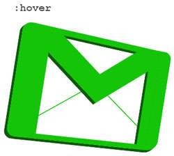
#gmail-logo2 .element5::after {}*/Mọi thứ đã gần hoàn tất. Logo Gmail của bạn sẽ trông giống như thế này:
Cuối cùng, hãy để cho logo một màu khác khi di chuột.
#gmail-logo2:hover *::after,
#gmail-logo2:hover *::before {
background:rgba(20, 196, 7, 1);
}
#gmail-logo2:hover .element1::before {
  box-shadow:
    -1px 1px 0 rgb(10, 90, 4),
    -2px 2px 0 rgb(10, 90, 4),
    -3px 3px 0 rgb(10, 90, 4),
    -4px 4px 0 rgb(10, 90, 4),
    -5px 5px 0 rgb(10, 90, 4),
    -6px 6px 0 rgb(10, 90, 4);
  -webkit-box-shadow:
    -1px 1px 0 rgb(10, 90, 4),
    -2px 2px 0 rgb(10, 90, 4),
    -3px 3px 0 rgb(10, 90, 4),
    -4px 4px 0 rgb(10, 90, 4),
    -5px 5px 0 rgb(10, 90, 4),
    -6px 6px 0 rgb(10, 90, 4);
  -moz-box-shadow:
    -1px 1px 0 rgb(10, 90, 4),
    -2px 2px 0 rgb(10, 90, 4),
    -3px 3px 0 rgb(10, 90, 4),
    -4px 4px 0 rgb(10, 90, 4),
    -5px 5px 0 rgb(10, 90, 4),
    -6px 6px 0 rgb(10, 90, 4);
  }
#gmail-logo2:hover .element1::after {
  box-shadow:
    -1px 1px 0 rgb(10, 90, 4),
    -2px 2px 0 rgb(10, 90, 4),
    -3px 3px 0 rgb(10, 90, 4),
    -4px 4px 0 rgb(10, 90, 4),
    -5px 5px 0 rgb(10, 90, 4),
    -6px 6px 0 rgb(10, 90, 4),
    -6px 7px 0 rgb(10, 90, 4);
  -moz-box-shadow:
    -1px 1px 0 rgb(10, 90, 4),
    -2px 2px 0 rgb(10, 90, 4),
    -3px 3px 0 rgb(10, 90, 4),
    -4px 4px 0 rgb(10, 90, 4),
    -5px 5px 0 rgb(10, 90, 4),
    -6px 6px 0 rgb(10, 90, 4),
    -6px 7px 0 rgb(10, 90, 4);
  -webkit-box-shadow:
    -1px 1px 0 rgb(10, 90, 4),
    -2px 2px 0 rgb(10, 90, 4),
    -3px 3px 0 rgb(10, 90, 4),
    -4px 4px 0 rgb(10, 90, 4),
    -5px 5px 0 rgb(10, 90, 4),
    -6px 6px 0 rgb(10, 90, 4),
    -6px 7px 0 rgb(10, 90, 4);
  }
#gmail-logo2:hover .element2::before {
  box-shadow:
    0 1px 0 rgb(10, 90, 4),
    0 2px 0 rgb(10, 90, 4),
    0 3px 0 rgb(10, 90, 4),
    0 4px 0 rgb(10, 90, 4),
    0 5px 0 rgb(10, 90, 4),
    -6px 6px 0 rgb(10, 90, 4);
  -webkit-box-shadow:
    0 1px 0 rgb(10, 90, 4),
    0 2px 0 rgb(10, 90, 4),
    0 3px 0 rgb(10, 90, 4),
    0 4px 0 rgb(10, 90, 4),
    0 5px 0 rgb(10, 90, 4),
    -6px 6px 0 rgb(10, 90, 4);
  -moz-box-shadow:
    0 1px 0 rgb(10, 90, 4),
    0 2px 0 rgb(10, 90, 4),
    0 3px 0 rgb(10, 90, 4),
    0 4px 0 rgb(10, 90, 4),
    0 5px 0 rgb(10, 90, 4),
    -6px 6px 0 rgb(10, 90, 4);
  }
#gmail-logo2:hover .element2::after {
  box-shadow:
    0 1px 0 rgb(10, 90, 4),
    0 2px 0 rgb(10, 90, 4),
    0 3px 0 rgb(10, 90, 4),
    0 4px 0 rgb(10, 90, 4),
    0 5px 0 rgb(10, 90, 4),
    -6px 6px 0 rgb(10, 90, 4);
  -webkit-box-shadow:
    0 1px 0 rgb(10, 90, 4),
    0 2px 0 rgb(10, 90, 4),
    0 3px 0 rgb(10, 90, 4),
    0 4px 0 rgb(10, 90, 4),
    0 5px 0 rgb(10, 90, 4),
    -6px 6px 0 rgb(10, 90, 4);
  -moz-box-shadow:
    0 1px 0 rgb(10, 90, 4),
    0 2px 0 rgb(10, 90, 4),
    0 3px 0 rgb(10, 90, 4),
    0 4px 0 rgb(10, 90, 4),
    0 5px 0 rgb(10, 90, 4),
    -6px 6px 0 rgb(10, 90, 4);
  }
#gmail-logo2:hover .element3::after {
  box-shadow:
    0 1px 0 rgb(10, 90, 4),
    0 2px 0 rgb(10, 90, 4),
    0 3px 0 rgb(10, 90, 4),
    0 4px 0 rgb(10, 90, 4),
    0 5px 0 rgb(10, 90, 4),
    -6px 6px 0 rgb(10, 90, 4);
  -webkit-box-shadow:
    0 1px 0 rgb(10, 90, 4),
    0 2px 0 rgb(10, 90, 4),
    0 3px 0 rgb(10, 90, 4),
    0 4px 0 rgb(10, 90, 4),
    0 5px 0 rgb(10, 90, 4),
    -6px 6px 0 rgb(10, 90, 4);
  -moz-box-shadow:
    0 1px 0 rgb(10, 90, 4),
    0 2px 0 rgb(10, 90, 4),
    0 3px 0 rgb(10, 90, 4),
    0 4px 0 rgb(10, 90, 4),
    0 5px 0 rgb(10, 90, 4),
    -6px 6px 0 rgb(10, 90, 4);
  }
#gmail-logo2:hover .element4::before {
  box-shadow:
    -1px 0 0 rgb(10, 90, 4),
    -2px 0 0 rgb(10, 90, 4),
    -3px 0 0 rgb(10, 90, 4),
    -4px 0 0 rgb(10, 90, 4),
    -5px 0 0 rgb(10, 90, 4),
    -6px 0 0 rgb(10, 90, 4),
    -7px 0 0 rgb(10, 90, 4),
    -8px 0 0 rgb(10, 90, 4);
  -moz-box-shadow:
    -1px 0 0 rgb(10, 90, 4),
    -2px 0 0 rgb(10, 90, 4),
    -3px 0 0 rgb(10, 90, 4),
    -4px 0 0 rgb(10, 90, 4),
    -5px 0 0 rgb(10, 90, 4),
    -6px 0 0 rgb(10, 90, 4),
    -7px 0 0 rgb(10, 90, 4),
    -8px 0 0 rgb(10, 90, 4);
  -webkit-box-shadow:
    -1px 0 0 rgb(10, 90, 4),
    -2px 0 0 rgb(10, 90, 4),
    -3px 0 0 rgb(10, 90, 4),
    -4px 0 0 rgb(10, 90, 4),
    -5px 0 0 rgb(10, 90, 4),
    -6px 0 0 rgb(10, 90, 4),
    -7px 0 0 rgb(10, 90, 4),
    -8px 0 0 rgb(10, 90, 4);
  }


 Lập trình
  SQL
SQL  Python
  Cơ sở dữ liệu
  AngularJS
  Cấu trúc dữ liệu và giải thuật


 Linux
Linux  Nền tảng Web
  Đồng hồ thông minh
  macOS
macOS  Chụp ảnh - Quay phim
  Thủ thuật SEO
  Phần cứng
  Kiến thức cơ bản
  Raspberry Pi
  Dịch vụ ngân hàng
  Dịch vụ nhà mạng
  Dịch vụ công trực tuyến
  Quiz công nghệ
  Microsoft Word 2016
  Microsoft Word 2013
  Microsoft Word 2007
  Microsoft Excel 2019
  Microsoft Excel 2016
  Microsoft PowerPoint 2019
  Microsoft PowerPoint 2016
  Google Sheets
  Học Photoshop
  HTML
HTML  Lập trình Scratch
  CSS và CSS3
  Lập trình C
  Lập trình C++
  Lập trình C#
  Học PHP
  Bootstrap
  SQL Server
  JavaScript
  Unix/Linux
  Văn phòng
  Tải game
  Tiện ích hệ thống
  Ảnh, đồ họa
  Internet
  Bảo mật, Antivirus
  Doanh nghiệp
  Video, phim, nhạc
  Mạng xã hội
  Học tập - Giáo dục
  Máy ảo
  AI Trí tuệ nhân tạo
  ChatGPT
  Copilot
  Gemini
  Khoa học vui
  Khám phá khoa học
  Bí ẩn - Chuyện lạ
  Sức khỏe
  Vũ trụ
  Khám phá thiên nhiên
  Bảo vệ Môi trường
  Phát minh Khoa học
  Điện máy
  Tivi
Tivi  Tủ lạnh
  Điều hòa
  Máy giặt
  Cuộc sống
  TOP
TOP  Kỹ năng
  Món ngon mỗi ngày
  Nuôi dạy con
  Mẹo vặt
  Phim ảnh, Truyện
  Làm đẹp
  DIY - Handmade
  Du lịch
  Quà tặng
  Giải trí
  Là gì?
  Nhà đẹp
  Tết 2025
  Giáng sinh - Noel
  Video
Video  Hướng dẫn
  Công nghệ
  Khoa học
  Ô tô, Xe máy
  Tấn công mạng
  Chuyện công nghệ
  Công nghệ mới
  Trí tuệ Thiên tài
  Tổng hợp